Brand Guide
Everyone (Whether they know it or not) loves congruency within a brand. Before you start on your project please read through this page, in it is everything you need to make any project you’re working on branded like The Square.
Know you’re loved.
↓↓↓↓↓
Brand Assets:
Feel free to save these on your desktop for future use.
Look at this ↑ wordmark ↑ didn’t the designer do a good job? They probably spent a lot of time on it.
And this ↓ icon ↓ seems like there was a lot of intentionality behind how it looks.
A HOUSE
A CROSS
A PLANT
A CITY BLOCK
I get it, we all get a wild creative hair and want to do something cool with what we’ve been given. There are however things that if you do we will ask kindly for you to change especially when it comes to our logo and icons, here is a list of some of those things:
Please don’t:
Use different colors
Blur or pixelate
Use strokes
Warp
Use gradients
Flip/turn icon or logo
Brand Colors:
#282726
#F2F1EA
#000000
#FFFFFF
#2477B6
#CF9D37
#EA332B
#6D6D45
Good color combination examples:
Bad color combination examples:
At the end of the day, color choice is all about contrast, it’s a little self explanatory. Use light neutrals over darker colors or vice-versa. Simple is often times better, there are cases where doing something crazy or traditionally “bad” might be done on purpose but we should just stick to simple and pretty.
Pictures and images:
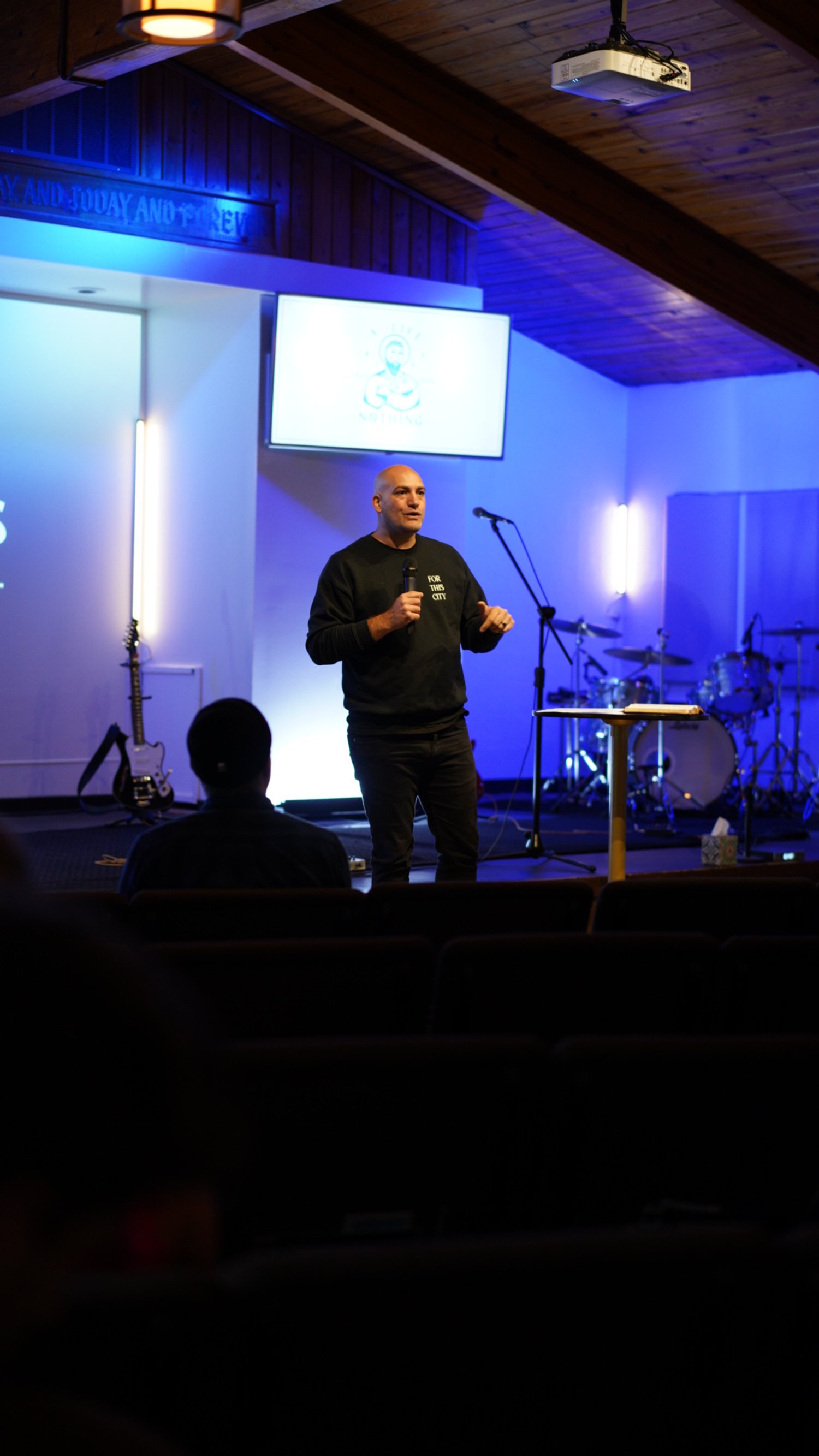
We live in a digital era, with photos as great ways to show who we are, how we love, or something cool we did. For The Square, it’s a priority to make sure all the images we use, whether on social media, website or something else, all be in-line with each other. Our approach is simple: be authentic and don’t be afraid to be artistic.
When picking a photo to use,
Stay away from anything with other brands in the image, that means writing on peoples shirts and other signage.
Don’t use images of peoples faces as the focal point unless you get permission, and even then it’s kind of weird.
Always try to use an image that was sourced in-house, Unsplash is great but every other church uses them.
Finally, and this feels weird saying, you don’t always need a photo. Sometimes its best to just use text.
Examples of great “on brand” photos:
